
.jpg) I have been having great firings lately. Brilliant color that also shows the texture in the clay. Perhaps a dozen consistent firing that delivered what I wanted.
I have been having great firings lately. Brilliant color that also shows the texture in the clay. Perhaps a dozen consistent firing that delivered what I wanted..jpg)
.jpg)
And then there was this firing.....
.jpg)
.jpg)
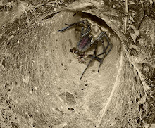
Very same glaze, very same temperature, very same reduction time in same chamber. But...no brilliance in color. The only change was using shiny advertising paper instead of plain newsprint. Who would have thought that would make a difference? Certainly not me! I have another firing in reduction now...with newsprint...anxious to see what happens....only one minute left before popping the top and seeing if I am back in the color!! Gotta go...............
Twenty minutes later.....got my color back!! But me, being me....I kinda like the earthen dark and pastel purple and blue colors in the "bad" firing. I got lemons...but I think I can make some lemonade? Another set of unusual firings to add to my...Miss Havisham's Garden...grouping.


.jpg)
.jpg)
.jpg)
The brilliant colors...are...I can't even describe how unbelievable they are and how awesome they highlight the texture. That being said, the less brilliant firing is gorgeous in a softer way. Equally, beautiful, just different.
ReplyDeleteI love all of them! The colors are gorgeous! Of course, I'm partial to blue. So subtle, yet so bright and cheerful. I'd enjoy any of them, and I'm certain most anyone who appreciates art would relish wearing one of these little gems!
ReplyDeletelooks like a thrilling working process!
ReplyDeleteI love your color experiments, ..beautiful!
Well now they're all fabulous!!I kind of like the "bad" batch myself!
ReplyDeleteI love them all!
ReplyDelete